
Helvetica
 | |
| Category | Sans-serif |
|---|---|
| Classification | Neo-grotesque[1] |
| Designer(s) | Max Miedinger Eduard Hoffmann |
| Foundry | Haas'sche Schriftgiesserei(Basel) |
| Date released | 1957 |
| Re-issuing foundries | Mergenthaler Linotype Company |
| Design based on | Akzidenz-Grotesk |
| Variations | Helvetica Inserat Helvetica Compressed Neue Helvetica Helvetica Now Others (see below) |
| Also known as | Neue Haas Grotesk |
| Shown here | Neue Helvetica |
| Metrically compatible with | |
Helvetica,also known by its original nameNeue Haas Grotesk,is a widely usedsans-seriftypefacedeveloped in 1957 by Swisstypeface designerMax Miedingerand Eduard Hoffmann.
Helvetica is aneo-grotesquedesign, one influenced by the famous 19th-century (1890s) typefaceAkzidenz-Groteskand other German and Swiss designs.[2]Its use became a hallmark of theInternational Typographic Stylethat emerged from the work of Swiss designers in the 1950s and 1960s, becoming one of the most popular typefaces of the mid-20th century.[3]Over the years, a wide range of variants have been released in different weights, widths, and sizes, as well as matching designs for a range of non-Latin alphabets. Notable features of Helvetica as originally designed include a highx-height,the termination of strokes on horizontal or vertical lines and an unusually tight spacing between letters, which combine to give it a dense, solid appearance.
Developed by theHaas'sche Schriftgiesserei(Haas Type Foundry) ofMünchenstein(Basel),Switzerland,its release was planned to match a trend: a resurgence of interest in turn-of-the-century "grotesque" sans-serifs among European graphic designers, that also saw the release ofUniversbyAdrian Frutigerthe same year.[4][5][6]Hoffmann was the president of the Haas Type Foundry, while Miedinger was a freelance graphic designer who had formerly worked as a Haas salesman and designer.[7]
Miedinger and Hoffmann set out to create a neutral typeface that had great clarity, had no intrinsic meaning in its form, and could be used on a wide variety of signage.[7]Originally named Neue Haas Grotesk (New Haas Grotesque), it was rapidly licensed by Linotype and renamed Helvetica in 1960, which inLatinmeans "Swiss", fromHelvetia,capitalising on Switzerland's reputation as a centre of ultra-modern graphic design.[8]A feature-length filmdirected byGary Hustwitwas released in 2007 to coincide with the 50th anniversary of the typeface's introduction in 1957.[9]
History
[edit]
The first version of the typeface (which later became known as Helvetica) was created in 1957 by Swiss type designer Max Miedinger. His goal is to design a new sans serif font that can compete in the Swiss market, as a neutral font that should not be given any additional meaning. The main influence on Helvetica was Akzidenz-Grotesk fromBerthold;Hoffman's scrapbook of proofs of the design shows careful comparison of test proofs with snippets of Akzidenz-Grotesk.[10]Its 'R' with a curved tail resembles Schelter-Grotesk, another turn-of-the-century sans-serif sold by Haas.[4][10][11]Wolfgang Homola comments that in Helvetica "the weight of the stems of the capitals and the lower case is better balanced" than in its influences.[12]
Attracting considerable attention on its release asNeue Haas Grotesk(Nouvelle Antique Haasin French-speaking countries),[a]Stempel andLinotypeadopted Neue Haas Grotesk for release inhot metal composition,the standard typesetting method at the time forbody text,and on the international market.[14]
In 1960, its name was changed by Haas' German parent companyStempeltoHelveticain order to make it more marketable internationally; it comes from theLatin namefor thepre-Roman tribesof what became Switzerland. Intending to match the success ofUnivers,Arthur Ritzel of Stempel redesigned Neue Haas Grotesk into a larger family.[15][16]The design was popular:Paul Shawsuggests that Helvetica "began to muscle out" Akzidenz-Grotesk in New York City from around summer 1965, when Amsterdam Continental, which imported European typefaces, stopped pushing Akzidenz-Grotesk in its marketing and began to focus on Helvetica instead.[17][18]It was also made available forphototypesettingsystems, as well as in other formats such asLetrasetdry transfers[19]and plastic letters,[20]and many phototypesetting imitations and knock-offs were rapidly created by competing phototypesetting companies.[21][22]
In the late 1970s and 1980s, Linotype licensed Helvetica toXerox,AdobeandApple,guaranteeing its importance in digital printing by making it one of the core fonts of thePostScriptpage description language.[23][24]This led to a version being included on Macintosh computers and a clone compatible metrically,Arial,on Windows computers. The rights to Helvetica are now held byMonotype Imaging,which acquired Linotype; the Neue Haas Grotesk digitisation (discussed below) was co-released with Font Bureau.[4]
Characteristics
[edit]
- Tallx-height,which makes it easier to read at distance.
- Tight spacing between letters.
- Anobliquerather thanitalicstyle, a common feature of almost all grotesque and neo-grotesque typefaces.
- Wide capitals of uniform width, particularly obvious in the wide 'E' and 'F'.
- Square-looking 's'.
- Bracketed top flag of '1'.
- Rounded off square tail of 'R'.
- Concave curved stem of '7'.
- Two-storied 'a' (with curves of bowl and stem), a standard neo-grotesque feature, and single-storey 'g'
Helvetica can't do everything...it can be really weak in small sizes. Shapes like 'C' and 'S' curl back into themselves, leaving tight "apertures"—the channels of white between a letter's interior and exterior... The lowercase 'e', the most common letter in English and many other languages, takes an especially unobliging form. These and other letters can be a pixel away from being some other letter.
Like many neo-grotesque designs, Helvetica has narrowapertures,which limits its legibility onscreen and at small print sizes. It also has no visible difference between upper-case 'i' and lower-case 'L', although the number 1 is quite identifiable with its flag at top left.[26][27]Its tight, display-oriented spacing may also pose problems for legibility.[28]Other fonts intended for legibility at small sizes such asVerdana,Meta,Trebuchet,or amonospace fontsuch asCourier,which makes all letters quite wide, may be more appropriate than Helvetica.
Usage examples
[edit]-
 Logo ofCassina S.p.A.
 -
 Sign inVienna,1973
 -
 Warszawa Centralna railway stationneon sign in Poland, 2010
 -
 Chicago 'L'signage
 -

-
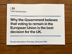 UK governmentpublication
 -
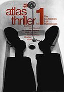 1964 poster forLes Diaboliques


Helvetica is among the most widely used sans-serif typefaces.[29]Versions exist forLatin,Cyrillic,Hebrew,Greek,Japanese,Korean,Hindi,Urdu,Khmer,andVietnamesealphabets.Chinesefaces have been developed to complement Helvetica.
Helvetica is a common choice for commercialwordmarks,including those for3M(includingScotch Tape),Adult Swim,American Apparel,BASF,Behance,Blaupunkt,BMW,Diaspora,ECM,Funimation,General Motors(until 2021),J. C. Penney,Jeep,Kaiser Permanente,Kawasaki,Knoll,Kroger,LG(until 2015),Lufthansa,Motorola,Nestlé,Oath Inc.,Panasonic,Parmalat,Philippine Airlines,Sears,Seiko Epson,Skype,Target,Texaco,Tupperware(until 2024),Viceland,Verizon,andZiff Davis.[30][31]Appleused Helvetica as the system typeface ofiOSuntil 2015.[32][33]
Helvetica has been widely used by theU.S. government;for example, federal income tax forms are set in Helvetica, andNASAused the type on theSpace Shuttle orbiter.[34]Helvetica is also used in theUnited States television rating system.TheCanadian governmentalso uses Helvetica as its identifying typeface, with three variants being used inits corporate identity program,and encourages its use in all federal agencies and websites.[35]

Helvetica is commonly used in transportation settings.[37]New York City'sMetropolitan Transportation Authority(MTA) adopted Helvetica for use in signage in 1989. From 1970 to 1989, the standard font was Standard Medium, an American release of Akzidenz-Grotesk, as defined byUnimark'sNew York City Transit Authority Graphic Standards Manual. The MTA system is still rife with a proliferation of Helvetica-like fonts, includingArial,in addition to some old signs in Medium Standard, and a few anomalous signs in Helvetica Narrow.[38][39][40]Helvetica is also used in theWashington Metro,theChicago 'L',Philadelphia'sSEPTA,and theMadrid Metro.[41]Amtrakused the typeface on the "pointless arrow" logo, and it was adopted by Danish railway companyDSBfor a time period.[42]In addition, the former state-owned operator of theBritish railway systemdeveloped its own Helvetica-basedRail Alphabetfont, which was also adopted by theNational Health Serviceand theBritish Airports Authority.[43]The Helvetica 77 variation is used in street and house signage inRigaand other municipalities inLatvia,although common road signage in the country uses a version ofDIN 1451.[44]
The typeface was displaced from some uses in the 1990s to the increased availability of other fonts on digitaldesktop publishingsystems, and criticism from type designers includingErik SpiekermannandMartin Majoor,both of whom have criticised the design for its omnipresence and overuse.[4][45]Majoor has described Helvetica as 'rather cheap' for its failure to move on from the model of Akzidenz-Grotesk.[46]
Road signs in Japan and South Korea formerly used Helvetica.[citation needed]
IBMused Neue Helvetica as its corporate typeface until 2017, spending over $1m annually on licensing fees.[47]It switched in 2017 to the customIBM Plexfamily, concluding that a custom open-source typeface would be more distinctive and practical, as it could be freely distributed and installed without rights issues.[47][48]
Helvetica has been used as the typeface of a logo ofABS-CBN/Kapamilya Channel's evening programming lineupPrimetime Bidasince 2007.
In 2019, theSwitzerland national football teambegan using Helvetica for itskit,which it wore for theUEFA Euro 2020tournament.[49]
Media coverage
[edit]
An early essay on Helvetica's public image as a font used by business and government was written in 1976 by Leslie Savan, a writer on advertising at theVillage Voice.[50]It was later republished in her bookThe Sponsored Life.[51]
In 2007, Linotype GmbH held the Helvetica NOW Poster Contest to celebrate the 50th anniversary of the typeface.[52][53]Winners were announced in the January 2008 issue of the LinoLetter.
In 2007, directorGary Hustwitreleased a documentary film,Helvetica(Plexifilm, DVD), to coincide with the fiftieth anniversary of the typeface. In the film, graphic designerWim Crouwelsaid, "Helvetica was a real step from the 19th century typeface... We were impressed by that because it was more neutral, and neutralism was a word that we loved. It should be neutral. It shouldn't have a meaning in itself. The meaning is in the content of the text and not in the typeface." The documentary also presented other designers who associated Helvetica with authority and corporate dominance, and whose rebellion from Helvetica's ubiquity created new styles.
From April 2007 to March 2008, theMuseum of Modern Artin New York City displayed an exhibit called "50 Years of Helvetica".[54]In 2011 theDisseny Hub Barcelonadisplayed an exhibit calledHelvetica. A New Typeface?.The exhibition included a timeline of Helvetica over the last fifty years, its antecedents and its subsequent influence, including in the local area.[55]
In 2011, one of Google'sApril Fools' Dayjokes centered on the use of Helvetica. If a user attempted to search for the term "Helvetica" using the search engine, the results would be displayed in the fontComic Sans.[56]
Variants
[edit]

A large number of variants of Helvetica were rapidly released to expand on its popularity, including new weights and languages. Linotype confessed by the time of a 1976advertorialthat things had become somewhat confused: "the series was not planned as a whole from its conception...the series is not as uniform asUnivers".[57][58]
Helvetica Light
[edit]Helvetica Light was designed by Stempel's artistic director Erich Schultz-Anker, in conjunction with Arthur Ritzel.[59]
Helvetica Inserat
[edit]Helvetica Inserat (German foradvertisement) is a version designed primarily for use in the advertising industry: this is a narrow variant that is tighter than Helvetica Black Condensed. It gives the glyphs an even largerx-heightand a more squared appearance, similar toSchmalfette Grotesk.Adobe's release notes date it to 1966 and state that it originated with Stempel.[60]
Helvetica Compressed (1966)
[edit]Designed byMatthew Carterand Hans-Jürg Hunziker forcold type.[61]It shares some design elements with Helvetica Inserat, but uses a curved tail in Q, downward pointing branch in r, and tilde bottom £. Carter has said that in practice it was designed to be similar toSchmalfette Groteskand to compete in this role with British designsImpactandCompacta,as this style was popular at the time.[62]Carter, who also later designed Helvetica Greek, had designed a modernised version of Akzidenz-Grotesk for signage atHeathrowin 1961, and commented later "if we'd known about [Helvetica] I'm sure we would have used it, since it's a much better typeface than the one I drew. But the typesetting trade was very conservative then, and new type designs traveled slowly."[32][63]The family consists of Helvetica Compressed, Helvetica Extra Compressed and Helvetica Ultra Compressed fonts. It has been digitised, for instance in the Adobe Helvetica release.
Helvetica Rounded (1978)
[edit]Helvetica Rounded is a version containing rounded stroke terminators, released for bold weights. Linotype's release notes date it to 1978.[64]
Helvetica Narrow
[edit]Helvetica Narrow is a version where its width is between Helvetica Compressed and Helvetica Condensed. The font was developed when printer ROM space was very scarce, so it was created by mathematically squashing Helvetica to 82% of the original width, resulting in distorted letterforms, with vertical strokes narrowed but horizontals unchanged.[65]Because of the distortion problems, Adobe dropped Helvetica Narrow in its release of Helvetica inOpenTypeformat, recommending users choose Helvetica Condensed instead.[66]
Helvetica Textbook
[edit]Helvetica Textbook is an alternate design of the typeface, which uses 'schoolbook'stylistic alternatesto increase distinguishability: a seriffed capital 'i' and 'j' to increase distinguishability, a 'q' with a flick upwards and other differences, such as the digits '1' and '4' similar to how handwritten digits are. The letters 'a', 't', 'u', and the digits '6' and '9' are replaced with designs similar to those in geometric sans-serifs such as those found inFutura,Akzidenz-Grotesk Schulbuch,and Avant Garde (except for 'u').[67]FontShop's FF Schulbuch is similar.[68][69]
Language variants
[edit]Helvetica Greek has gone through several versions.Letrasetdesigned a semi-official version for their dry transfer lettering system, available by 1970, which sold well but was considered unidiomatic by Linotype.[70]Linotype published a 1971 version designed byMatthew Carterwhich was available for phototypesetting and so for general purpose printing such as extended text.[70][71][62][72][73][74]Carter felt in 1974 that the Letraset version was "a poor thing" and Linotype's version was "the real one" but that Letraset's was well-enough accepted in Greece that he felt it had "caused resistance to our version".[70]Linotype published a new version in 2001 designed by John Hudson at Tiro Typeworks.[70][71]
The Cyrillic version was designed in-house in the 1970s at D Stempel AG, then critiqued and redesigned in 1992 under the advice ofJovica Veljović,althougha pirated versionhad already been created in 1963 by Russian designers Maxim Zhukov and Yuri Kurbatov.[75][76][77]
Helvetica World
[edit]Helvetica World supports Arabic, Cyrillic, Greek, Hebrew, and Vietnamese scripts.[78]
The family consists of four fonts in two weights and one width, with complementary italics.
The Arabic glyphs were based on a redesigned Yakout font family from Linotype. Latin kerning and spacing were redesigned to have consistent spacing.[79]John Hudson ofTiro Typeworksdesigned the Hebrew glyphs for the font family,[80]as well as the Cyrillic, and Greek letters.[81]
Neue Helvetica (1983)
[edit]
Neue Helvetica (German pronunciation:[ˈnɔʏə]), sometimes Helvetica Neue in some digital files,[82]is a reworking of the typeface with a more structurally unified set of heights and widths. Other changes include improved legibility, heavier punctuation marks, and increased spacing in the numbers.
Neue Helvetica uses a numerical design classification scheme, likeUnivers.The font family is made up of 51 fonts including nine weights in three widths (8 in normal width, 9 in condensed, and 8 in extended width variants) as well as an outline font based on Helvetica 75 Bold Outline (no Textbook or rounded fonts are available). Linotype distributes Neue Helvetica on CD.[83]Neue Helvetica also comes in variants for Central European and Cyrillic text.
It was developed atD. Stempel AG,aLinotypesubsidiary. The studio manager was Wolfgang Schimpf, and his assistant was Reinhard Haus; the manager of the project was René Kerfante.Erik Spiekermannwas the design consultant and designed the literature for the launch in 1983.[84][85]Figures were widened and some condensed weights changed from having nearly flat-sided verticals to a more continuous curve throughout the entire height.[86]
DesignerChristian Schwartz,who would later release his own digitisation of the original Helvetica designs (see below), expressed disappointment with this and other digital releases of Helvetica: "digital Helvetica has always been one-size-fits-all, which leads to unfortunate compromises...the spacing has ended up much looser than Miedinger's wonderfully tight original at display sizes but much too tight for comfortable reading at text sizes."[87]
iOSused first Helvetica then Neue Helvetica[88]as its system font. All releases ofmacOSprior toOS X Yosemite (10.10)usedLucida Grandeas the system font. The version of Neue Helvetica used as the system font in OS X 10.10 is specially optimised;Apple's intention is to provide a consistent experience for people who use both iOS and OS X.[89][82]Apple replaced Neue Helvetica with the similarly lookingSan FranciscoiniOS 9andOS X El Capitan (10.11),[90]meaning OS X 10.10 was the only macOS version to use Neue Helvetica as the system font.
Neue Helvetica W1G (2009)
[edit]It is a version with Latin Extended, Greek, Cyrillic scripts support. Only OpenType CFF font format was released.
The family includes the fonts from the older Neue Helvetica counterparts, except Neue Helvetica 75 Bold Outline. Additional OpenType features include subscript/superscript.
Neue Helvetica Arabic (2009)
[edit]
Designed by Lebanese designerNadine Chahine,[91]it is a version with Arabic script support. Only OpenType TTF font format was released.[92]
The family includes three fonts in three weights and one width, without italics (45, 55, 65).
Neue Helvetica eText (2011)
[edit]It is a version of Neue Helvetica optimised for on-screen use, designed by Akira Kobayashi of Monotype Imaging. Changes from Neue Helvetica include more open spacing.[93]Unlike Helvetica, the capitals are reduced in size so the lower-caseascendersrise above them, a common feature associated with text typefaces.[86][94]
The family includes eight fonts in four weights and one width, with complementary italics (45, 46, 55, 56, 65, 66, 75, 76). OpenType features include numerators/denominators, fractions, ligatures, scientific inferiors, subscript/superscript.[95]
(Neue) Helvetica Thai (2012)
[edit]Thai font designerAnuthin Wongsunkakonof Cadson Demak Co. createdThai versionsof Helvetica and Neue Helvetica fonts.[96][97]The design uses loopless terminals in Thai glyphs,[98][99]which had also been used by Wongsunkakon's previous design, Manop Mai (New Manop).[100]
Neue Helvetica Georgian (2015)
[edit]
It is a version with Georgian script support. Designed by Akaki Razmadze at Monotype Bad Homburg.[101]
Only OpenType CFF and TTF font formats were released.
The family includes eight fonts in eight weights and one width, without italics (25, 35, 45, 55, 65, 75, 85, 95).
Neue Helvetica Armenian (2016)
[edit]Designed by Edik Ghabuzyan, it is a version of Neue Helvetica supporting Armenian language.[102]
The family includes 16 fonts in 8 weights (ultra light, thin, light, regular, medium, bold, heavy, black) with complementary italics.
Neue Helvetica World (2017)
[edit]Designed by Nadine Chahine, Linotype Design Studio, Monotype Design Studio and Edik Ghabuzyan, it is a version of Neue Helvetica with support of Latin, Cyrillic, Greek, Arabic, Hebrew, Thai, Armenian, Georgian and Vietnamese scripts for total 181 languages, and complete support of Unicode block u+0400.[103][104][105][106]Published in November 2017 by Linotype, it was released in Truetype and OpenType CFF formats.
The family includes 6 fonts in 3 weights (45 Light, 55 Roman, 75 Bold), with complimentary italic. Roman fonts include 1,708 glyphs and 1,285 glyphs for italics.
For working with other languages, the publisher also recommended following complementary fonts:
- Devanagari: Saral Devanagari
- Japanese: Tazugane Gothic, Yu Gothic
- Korean: YD Gothic 100, YD Gothic 700
- Simplified Chinese: M Ying Hei PRC, M Hei PRC
- Traditional Chinese: M Ying Hei HK, M Hei HK
Neue Haas Grotesk (2010)
[edit]
Christian Schwartz's digitisation is based on original settings of the metal type and uses the typeface's original name.[107][108][109][110]It was released by Linotype (later Monotype Imaging),Commercial Type,and Font Bureau with an article on the history of Helvetica by Professor Indra Kupferschmid.[10]
Unlike earlier digitisations, Schwartz created two differentoptical sizes(labelled Text and Display), which have different spacing metrics giving tighter spacing at display size and looser spacing to increase legibility inbody text.The release includes a number of features not present on digitisations branded as Helvetica,stylistic alternatessuch as separate punctuation sets for upper- and lower-case text, "modernist" cedilla designs styled to match the comma and reduced-height numbers to blend into extended text.[111][b]Both optical sizes provide stylistic alternates for a straight-legged upper case "R", while the Display variant additionally provides stylistic alternates for a lower case "a" without tail.[112][113]It originated from an abandoned redesign plan forThe Guardiannewspaper. Writing forTypographica,Matthew Butterickdescribed the release as better than any previous digital release of Helvetica "it's never looked better".[114]Users includeBloomberg Businessweek,theWhitney Museum,and for the albumMidnights,Taylor Swift.[115][116][117]Schwartz's company Commercial Type have additionally developed a companion monospaced version, agate version for small sizes and stencil font.[118]The release does not include condensed weights or support for Greek and Cyrillic.
Variable Font Version
[edit]The Text optical size of Neue Haas Grotesk is available onWindows 11via "Pan-European Supplemental Fonts" optional feature.[119]This version is avariable fontand provides weights ranging from Ultra Thin to Black.[120][121]As of 2023, the variable font version of Neue Haas Grotesk is not yet otherwise available.
Neue Haas Grotesk Text is also available onWindows 10via "Pan-European Supplemental Fonts",[122]but this release includes static fonts instead of variable fonts.
Helvetica Now (2019)
[edit] | |
| Category | Sans-serif |
|---|---|
| Classification | Neo-grotesque sans-serif |
| Designer(s) | Jan Hendrik Weber and Charles Nix |
| Foundry | Monotype |
| Date released | 2019 |
| Design based on | Neue Helvetica |
In April 2019,Monotypeannounced an update of Neue Helvetica called "Helvetica Now", designed by Jan Hendrik Weber and Charles Nix of Monotype Imaging.[123][124][125]The family has one width in threeoptical sizes,Text, Micro and Display in 8, 6, and 10 weights respectively.[126]The condensed version corresponding to these optical sizes and weights was published later in 2021, along with Helvetica Now Variable.[127]
A key difference between the three optical sizes is the terminal design: Display retains the horizontal terminals in previous digital releases of Helvetica; Micro features diagonal terminals for many characters (e.g., lowercase "e" and "c" ); while the design of Text is somewhere in between Display and Micro.[128][129]
Features include circled figures and redesigned arrow and @ glyphs.[130]It also includes a number of alternate characters including curled lower-case "L", spurless rounded "G", a straight-legged "R" (found in Neue Haas Grotesk), single-story "a" (found in Helvetica Textbook) and lowercase "u" without a spur.[131][132]
Helvetica Now Variable (2021)
[edit]Helvetica Now was also released as avariable font,which has two styles (Regular and Italic) and three adjustable axes (weight, width, and optical size). Supported weight ranges include hairline to extra black, optical sizes include four point to infinity, widths include compressed and condensed.[133][134][135]
Helvetica clones
[edit]
Derivative designs based on Helvetica were rapidly developed, taking advantage of the lack of copyright protection in thephototypesettingfont market of the 1960s onward.[21][136]Some of these were straight clones, simply intended to be direct substitutes.[137]Many of these are almost indistinguishable from Helvetica, while some add subtle differences.
Substitute Helvetica designs that have survived into or originated during the digital period have includedMonotype's Arial, Compugraphic's CG Triumvirate, ParaType's Pragmatica,Bitstream's Swiss 721,URW++'sNimbus SansandScangraphic's Europa Grotesk.[21][138]Berthold itself responded to Helvetica's popularity with Akzidenz-Grotesk Buch, effectively a Helvetica clone.[139][140][141][142]Besides Helvetica imitations, Helvetica was available in custom derivatives with unusual special-order characters for many years, notably a straight-legged 'R' and round-topped 'A'.[10]CNNuses a custom derivative, "CNN Sans", which has a '1' with a base and larger x-height.[143][144][145]
Nimbus Sans
[edit]URW(later URW++) under the leadership ofPeter Karowproduced a modification of Helvetica calledNimbus Sans.[139]This is an extremely large font family with optical sizes spaced for different sizes of text and other variants such as stencil styles.[146]Florian Hardwig has described its display-oriented styles, with tight spacing, as more reminiscent of Helvetica as used in the 1970s from cold type than any official Helvetica digitisation.[147][148]
Arial and MS Sans Serif
[edit]Monotype'sArial,created for IBM and also used by Microsoft, is indistinguishable by most non-specialists.[149]Matthew Carter, who was a consultant for IBM during its design process, describes it as "a Helvetica clone, based ostensibly on theirGrots 215 and 216"(Monotype's old 1920s sans-serif family, popular in British trade printing in the metal type period, and itself based on the BauerVenus-Groteskfamily).[23]Differences include:
- Helvetica's strokes are typically cut either horizontally or vertically. This is especially visible in the t, r, f, and C. Arial employs slanted stroke cuts, following Monotype Grotesque.
- Helvetica's G has a spur at bottom right; Arial does not, but instead has a vertical stroke connecting the curved portion to the crossbar.
- The tail of Helvetica's R is more upright whereas Arial's R is more diagonal.
- The number 1 of Helvetica has a square angle underneath the upper spur, Arial has a curve.
- The Q glyph in Helvetica has a straight cross mark, while the cross mark in Arial has a slight curve.
The design was created to substitute for Helvetica: Arial (and many other clones of the period) are metrically identical to the PostScript version of Helvetica, so that a document designed in Helvetica could be displayed and printed correctly without IBM having to pay Linotype for a Helvetica license on its printers.[23][150][151]
Microsoft's "Helv" design, later known as "MS Sans Serif",is a sans-serif typeface that shares many key characteristics to Helvetica, including the horizontally and vertically aligned stroke terminators and more-uniform stroke widths within a glyph.[152]
Free Helvetica substitute fonts
[edit]
- Nimbus Sans L,a version of URW's Nimbus Sans spaced to match the standard Linotype/PostScript version of Helvetica, was released under theGNU General Public Licensein 1996, and donated to theGhostscriptproject to create a free PostScript alternative.[153][154]It (or a derivative) is used by much open-source software such asRas a system font.[155][156]
- TeX Gyre Heros[157]– a derivative of Nimbus Sans L with enhanced letter forms and metrics – has been prepared for use in theTeXscientific document preparation software, and since 2009 general under the GUST font license.[158][159]
- FreeSansis a free font descending from URW++ Nimbus Sans L, which in turn descends from Helvetica.[160]It is one of free (GPL) fonts developed in GNU FreeFont project, first published in 2002.
Other such typefaces take creative liberties from Helvetica and its basic letter shapes.
- Liberation Sansis a metrically equivalent font to Arial developed bySteve MattesonatAscenderand published byRed Hatunder theSIL Open Font License.[161][162]It is used in some Linux distributions as default font replacement for Arial.[163]Oraclefunded the additional development of Liberation Sans Narrow in 2010.[164][165]Google commissioned a variation namedArimoforChromeOS.
- Robotowas developed by Christian Robertson of Google as the system font for itsAndroidoperating system; this has a more condensed design with the influence of straight-sided geometric designs likeDIN 1451.
- Inter(originallyInter UI) is a fork of Roboto that resembles Apple's San Francisco typeface.[166]
- Mona Sans,aGitHubvariable font released underSIL Open Font License,stands out from the above examples with its'single-storey'lowercasea.[167]
Derivative designs
[edit]Some fonts based on Helvetica are intended for different purposes and have clearly different designs. Digital-period font designerRay Larabiehas commented that in the 1970s "everyone was modifying Helvetica with funky curls, mixed-case and effects".[168]Indeed, in one 1973 competition to design new fonts, three of the 20 winners were decorative designs inspired by Helvetica.[169]
Zhukov and Kurbatov version
[edit]In 1963, two students at the Moscow Print Institute designed their own version of Helvetica, one of whom, Maxim Zhukov, would become one of theSoviet Union's most prominent typographers. Zhukov and his partner Yuri Kurbatov used upright cursive forms for several of the lowercase letters, which allowed for several of the Helvetica forms to be transferred more directly into Cyrillic.
Their version received widespread use in phototypesetting, especially among other students at the Moscow Print Institute, despite never being commercially released. Zhukov and Kurbatov attempted to publish the typeface in 1964 but were rejected due to the font's being too closely associated withcapitalism;this was one of the major factors as to why an official Cyrillic Helvetica,Pragmatica,would not be released in theSoviet blocuntilperestroikain 1989.[77][170][c]
Forma (1968)
[edit]
Created byAldo Novareseat the Italian type foundryNebiolo,Forma was a geometric-influenced derivative of Helvetica with a'single-storey''a' and extremely tight spacing in the style of the period.[171][172][173]It was offered with 'request'stylistic alternatesimitating Helvetica more closely.[171][174]Forma has been digitised bySoftMakeras "Formula" and (in a much more complete version withoptical sizes) asForma DJRby David Jonathan Ross atFont BureauforTatlermagazine.[175]
Manoptica
[edit]
Manoptica(1973) was an early effort to adapt Helvetica to theThai script.It is named after and designed by Manop Srisomporn, who designed several typefaces for Thai using the same innovations he used for Manoptica (such as an adaptation ofEurostile). It was highly influential inThai typographyin that it popularized the removal of the small loops and other flourishes that had theretofore been distinguishing marks on Thai characters and adopted letter forms that bore strong resemblance to Latin letters. It became a widely popular style in advertising and influenced other simplified typefaces for Thai in the following decades.[176]The adoption of loopless typefaces remains a source of controversy in Thai typography.[177]
Helvetica Flair and others
[edit]
Designed by Phil Martin at Alphabet Innovations, Helvetica Flair is an unauthorised phototype-period redesign of Helvetica addingswashesandunicase-inspired capitals with a lower-case design. Considered a hallmark of 1970s design, it has never been issued digitally. It is considered to be a highly conflicted design, as Helvetica is seen as a spare and rational typeface and swashes are ostentatious: font designer Mark Simonson described it as "almost sacrilegious". Martin would later claim to have been accused of "typographic incest" by one German writer for creating it.
Helvetica Flair was one of several derivative fonts created by Martin in the 1970s (and a particularly legally questionable one, since it was directly named 'Helvetica').[178][179]Martin also drew 'Heldustry', a fusion of Helvetica withEurostile,[180]and 'Helserif', a redesign of Helvetica withserifs,[181]and these have both been digitised.[137][182][183]
Shatter LET (1973)
[edit]
Designed by Vic Carless, Shatter assembles together slices of Helvetica to make a typeface that seems to be in motion, or broken and in pieces.[184]It was published byLetrasetafter jointly winning their 1973 competition to design new fonts.[169]
Writing in 2014, Tim Spencer praised the design for its ominous effect, writing that it offered "glitch-like mechanical aggression [and] cold, machine-induced paranoia. It attacked the Establishment's preferred information typography style with a sharp edge and recomposed it in a jarring manner that still makes your eyes skitter and your brain tick trying to recompose it. Shatter literally sliced up Swiss modernist authority."[185]
Unica
[edit]
UnicabyTeam '77(André Gürtler, Christian Mengelt and Erich Gschwind) is as a hybrid of Helvetica,UniversandAkzidenz-Grotesk.It was developed in the 1970s for electronic on-screenphototypesettingand released in 1980. As phototypesetting was soon replaced by desktop publishing and because of a legal dispute, the typeface rapidly disappeared from the market. In mid 2010s, two digital versions were released: the Swiss foundryLinetoreleased LL Unica77 with input from Christian Mengelt,[186][187]while Linotype released Neue Haas Unica.[188]
Chalet
[edit]House Industries' Chalet family is a series of fonts based on Helvetica, inspired by its many derivatives and adaptations in post-war design, and organised by "date" to '1960' (conventional), '1970' and '1980' (both more radically altered and "science fiction" in feel).[189]House Industries, who are known for outlandish font marketing methods, promoted Chalet through presenting it as inspired by the branding and career progression of a fictitious Swisshaute couturedesigner, "René Chalet" (Chaletbeing French for a small wooden house, so a play on the design company's name).[190][191][192]
Coolvetica
[edit]
In the digital period, Canadian type designerRay Larabiehas released several digital fonts based upon Helvetica. The most widely known and distributed of these is Coolvetica, which Larabie introduced in 1999; Larabie stated he was inspired by Helvetica Flair, Chalet, and similar variants in creating some of Coolvetica's distinguishing glyphs (most strikingly a swash on capital 'G', lowercase 'y' based on the letterforms of 'g' and 'u,' and a fully curled lowercase 't'), and chose to set a tight default spacing optimised for use indisplay type.[193]Larabie's company Typodermic offers Coolvetica in a wide variety of weights as a commercial release, with the semi-bold as freeware taster. As of 2017, the semi-bold remains Larabie's most popular font.[194][195][196]Larabie has also taken inspiration from Helvetica in some of his other designs, including Movatif and GGX88.[197][198]
Notes
[edit]- ^"Antique" is a term used in French for sans-serifs (for instanceAntique Olive), although in English it traditionally historically referred toslab-serifs.[13]
- ^This feature was also included inRobert Slimbach's neogrotesque Acumin (2014) for Adobe.[94]
- ^The lowercase forms of Sowjietische Haas Grotesk were digitized as "Soyuz Grotesk" by Roman Goritsky and released into thepublic domainby The Temporary State. Goritsky added a Latin script, which he reconstructed in the same way Sowjietische Haas Grotesk had been constructed from Helvetica but in reverse, by using theCyrillic forms and adapting them to Latin.[76][77]
References
[edit]- ^Kupferschmid, Indra."Combining Type With Helvetica".FontShop (archived).Archived fromthe originalon 30 April 2010.Retrieved29 April2018.
- ^Berry, John."A Neo-Grotesque Heritage".Adobe Systems.Archivedfrom the original on 16 October 2015.Retrieved15 October2015.
- ^Shinn, Nick(2003)."The Face of Uniformity"(PDF).Graphic Exchange.Archived fromthe original(PDF)on 18 November 2016.Retrieved18 July2022.
- ^abcdKupferschmid, Indra (14 October 2014)."I had never loved Helvetica".Archivedfrom the original on 25 October 2018.Retrieved5 October2015.
- ^Gerstner, Karl(1963)."A new basis for the old Akzidenz-Grotesk (English translation by Forgotten Shapes)"(PDF).Der Druckspiegel.Archived fromthe original(PDF)on 2017-10-15.Retrieved15 October2017.
- ^Gerstner, Karl(1963)."Die alte Akzidenz-Grotesk auf neuer Basis"(PDF).Der Druckspiegel.Archived fromthe original(PDF)on 2017-10-15.Retrieved15 October2017.
- ^abHelvetica(Documentary). 2007-09-12.
- ^Shaw, Paul."Helvetica and Univers addendum".Blue Pencil.Archivedfrom the original on 24 September 2015.Retrieved1 July2015.
- ^Shaw, Paul."The Univers of Helvetica: A Tale of Two Typefaces".Print.Archivedfrom the original on 17 September 2019.Retrieved26 June2016.
- ^abcdKupferschmid, Indra."Neue Haas Grotesk - History".Font Bureau.Archived fromthe originalon 9 August 2017.Retrieved4 August2017.
- ^Langer, Axel."One Typeface, Two Fathers".Helvetica Forever.University of Applied Sciences Düsseldorf.Archivedfrom the original on 24 October 2017.Retrieved29 April2018.
- ^Homola, Wolfgang."Type design in the age of the machine. The 'Breite Grotesk' by J. G. Schelter & Giesecke"(PDF).University of Reading (archived). Archived fromthe original(PDF)on 12 January 2011.Retrieved17 January2018.
- ^""Nouvelle Antique Haas" aka "Neue Haas Grotesk" aka "Helvetica" promotional, by Fritz Büler, Walter Bosshardt, 1959 ".Flickr.Herb Lubalin Study Center. 29 July 2011.Archivedfrom the original on 21 June 2019.Retrieved29 April2018.
- ^Montrose-Helker, William."Post-War Type Marketing: A comparative study of three European type foundries during the 1950s and 1960s".University of Reading.Archivedfrom the original on 3 May 2022.Retrieved29 April2018.
- ^"myfonts: Arthur Ritzel".New.myfonts.com. 1999-02-22. Archived fromthe originalon May 27, 2012.Retrieved2009-06-08.
- ^Shaw, Paul."Helvetica & Univers".Blue Pencil.Archivedfrom the original on 3 May 2021.Retrieved1 July2015.
- ^Shaw, Paul."From the Archives no. 15—Helvetica and Standard".Paul Shaw Letter Design (blog).Archivedfrom the original on 22 April 2021.Retrieved27 December2017.
- ^Shaw, Paul."From the Archives no. 17—More on Helvetica in the United States".Paul Shaw Letter Design.Archivedfrom the original on 5 June 2021.Retrieved29 April2018.
- ^Müller, Lars; Malsy, Victor; Langer, Axel; Kupferschmid, Indra (2009).Helvetica Forever: Story of a Typeface.Baden, Switzerland: Lars Müller.ISBN978-3-03778-121-0.
- ^Shaw, Paul."Blue Pencil no. 19—Helvetica and the New York City Subway System".Paul Shaw Letter Design.Archivedfrom the original on 30 April 2018.Retrieved29 April2018.
- ^abcSimonson, Mark."The Scourge of Arial".Mark Simonson Studio Notebook.Archivedfrom the original on 6 March 2016.Retrieved19 March2016.
Many type manufacturers in the past have done knock-offs of Helvetica that were indistinguishable or nearly so. For better or worse, in many countries—particularly the U.S.—while typeface names can be protected legally, typeface designs themselves are difficult to protect. So, if you wanted to buy a typesetting machine and wanted the real Helvetica, you had to buy Linotype. If you opted to purchase Compugraphic, AM, or Alphatype typesetting equipment, you couldn't get Helvetica. Instead you got Triumvirate, or Helios, or Megaron, or Newton, or whatever. Every typesetting manufacturer had its own Helvetica look-alike. It's quite possible that most of the "Helvetica" seen in the '70s was actually not Helvetica.
- ^Craig, James; Malmstrom, Margit (1978).Phototypesetting: a design manual(1st ed.). New York: Watson-Guptill. p.35.ISBN978-0-8230-4011-7.
Helvetica is, without a doubt, the most widely used sans serif typeface.
- ^abcShaw, Paul; Carter, Matthew; McDonald, Rod."Blue Pencil no. 18—Some history about Arial".Paul Shaw Letter Design.Archivedfrom the original on 29 September 2021.Retrieved30 April2018.
- ^Simonson, Mark."Monotype's Other Arials".Mark Simonson Studio.Archivedfrom the original on 15 July 2015.Retrieved14 July2015.
- ^Covert, Adrian (3 June 2014)."Why Apple's New Font Won't Work On Your Desktop".FastCoDesign.Archivedfrom the original on 6 July 2017.Retrieved28 November2014.
- ^Spiekermann, Erik."Helvetica Sucks".Spiekermann blog.Archivedfrom the original on 5 June 2021.Retrieved15 July2015.
- ^Spiekermann, Erik."Distinct lettershapes are important. Or can you work out this code? 1, I or l?".Twitter.Archivedfrom the original on 5 June 2021.Retrieved14 June2015.
- ^Spolsky, Joel (24 October 2001)."User Interface Design For Programmers".Joel On Software.Archivedfrom the original on 19 November 2016.Retrieved15 July2015.
- ^"Uses of Helvetica".Fonts In Use.Archivedfrom the original on 2021-06-10.Retrieved2014-02-18.
- ^"BBC News - Helvetica at 50".2007-05-09.Archivedfrom the original on 2013-09-18.Retrieved2009-02-20.
- ^Ferguson, Brad (24 July 2015)."Helvetica: The Backlash".Print.Archivedfrom the original on 17 September 2019.Retrieved29 April2018.
- ^abRawsthorn, Alice (April 2007)."Helvetica: The little typeface that leaves a big mark".The New York Times.Archivedfrom the original on 5 June 2021.Retrieved11 January2016.
- ^Prisco, Jacopo (15 August 2017)."The game-changing typeface made to go unnoticed".CNN.Archivedfrom the original on 12 January 2024.Retrieved12 January2024.
- ^Helvetica(Documentary). 2007-09-12.
- ^"Federal Identity Program Manual - 1.1 Design".Treasury Board of Canada Secretariat.Archivedfrom the original on 2015-06-19.Retrieved2015-06-19.
A consistent typography is fundamental to corporate identity, and three faces from the Helvetica type family have been adopted for purposes of the FIP. They were chosen for their versatility, excellent legibility and contemporary design.
- ^Campbell-Dollaghan, Kelsey (7 May 2013)."Six Beautiful Artefacts From The Dawn Of Digital Typography".Gizmodo.Archivedfrom the original on 21 June 2019.Retrieved30 April2017.
- ^"A Brief History of Fonts in Transit"(PDF).livewellcollaborative.org/.Archived fromthe original(PDF)on 2015-02-26.Retrieved2015-06-22.
- ^Shaw, Paul."The (Mostly) True Story of Helvetica and the New York City Subway".AIGA.Archived fromthe originalon 5 July 2014.Retrieved6 November2016.
- ^Bierut, Michael(26 March 2011)."When in Helvetica".Wall Street Journal.Archivedfrom the original on 6 June 2021.Retrieved6 November2016.
- ^Lee, Jennifer(4 December 2008)."How Helvetica Took Over the Subway".New York Times.Archivedfrom the original on 24 February 2021.Retrieved6 November2016.
- ^"Elementos Básicos de Identidad Corporativa de Metro de Madrid"[Basic Elements of the Corporate Identity of the Metro of Madrid](PDF).metromadrid.es(in Spanish). Metro de Madrid. Archived fromthe original(PDF)on 2015-06-23.Retrieved2015-06-23.
- ^"Eye blog » Rue Britanica.Typeface name changes after Eye magazine goes to press".Blog.eyemagazine.com. 2009-04-20.Archivedfrom the original on 2009-05-02.Retrieved2013-09-21.
- ^Walters, John."New Rail Alphabet".Eye Magazine.Retrieved29 April2018.[permanent dead link]
- ^"Par ielu un laukumu nosaukuma zīmju, ēku, telpu grupu numura zīmju un virziena rādītāju uz infrastruktūras, kultūras vai tūrisma objektiem izvietošanas kārtību Rīgas pilsētā".LIKUMI.LV(in Latvian).Archivedfrom the original on 2019-06-21.Retrieved2019-06-18.
- ^Spiekermann, Erik (1987)."Post Mortem or how I once designed a typeface for Europe's biggest company"(PDF).Baseline(9): 6–9.Archived(PDF)from the original on 8 March 2021.Retrieved20 March2016.
- ^Majoor, Martin (Spring 2007)."Inclined to be dull".Eye.Vol. 16, no. 63. pp. 33–7.Archivedfrom the original on 15 October 2012.Retrieved3 August2015.
- ^abQuito, Anne (10 November 2017)."IBM has freed itself from the tyranny of Helvetica".Quartz.Archivedfrom the original on 13 June 2020.Retrieved1 May2018.
- ^Czarnecki, Lucas."Can IBM Plex topple Helvetica?".Type.Archived fromthe originalon 2018-05-01.Retrieved1 May2018.
- ^"PUMA chose Helvetica font for Switzerland's new jersey".nss magazine.Retrieved2021-06-29.
- ^Lupton, Ellen."Forever Helvetica".Metropolis Magazine.Archived fromthe originalon 7 October 2016.Retrieved4 July2016.
- ^Savan, Leslie (1994).The Sponsored Life: Ads, TV, and American Culture.Philadelphia: Temple University Press.ISBN978-1-4399-0490-9.
- ^"Linotype Announces Helvetica NOW Poster Contest".Creativepro.com. 27 June 2007.Archivedfrom the original on 2009-09-18.Retrieved2009-06-08.
- ^"Helvetica NOW Poster Contest".Linotype.com. 2008-08-19.Archivedfrom the original on 2008-08-30.Retrieved2009-06-08.
- ^"Exhibitions 2007: 50 Years of Helvetica".Museum of Modern Art,New York City.Archivedfrom the original on 2009-05-24.Retrieved2008-11-16.
- ^Helvetica. A New Typeface?Archived2012-08-28 at theWayback MachineatDisseny Hub Barcelona
- ^Pickel, Janet (1 April 2011)."April Fool's Day: Helvetica becomes Comic Sans and Gmail Motion is on the move".The (Harrisburg, PA) Patriot-News.Archivedfrom the original on 18 November 2018.Retrieved1 April2011.
- ^Shaw, Paul."From the Archives no. 26—Helvetica and Univers".Paul Shaw Letter Design.Archivedfrom the original on 3 May 2021.Retrieved28 April2018.
- ^"Everything you ever wanted to know about Helvetica – but were afraid to ask".Upper & Lower Case.3(1): 43–6. Archived fromthe originalon 21 June 2019.Retrieved28 April2018.
- ^de Jong, Cees W; Purvis, Alston W; Friedl, Friedrich (2005).Creative Type: A Sourcebook of Classic and Contemporary Letterforms.Thames & Hudson.ISBN978-0-500-51229-6.Archived fromthe originalon April 22, 2009.Retrieved2009-06-08.
- ^"Helvetica Inserat".MyFonts.Adobe. Archived fromthe originalon 9 June 2021.Retrieved29 April2018.
- ^Sherman, Nick; Carter, Matthew (26 April 2015)."Helvetica Compressed".Flickr.Archivedfrom the original on 21 June 2019.Retrieved30 April2018.
Helvetica Compressed was planned as a three-part family [to fit into] the Linofilm's unit system...I designed Helvetica Compressed and Helvetica Extra Compressed, on my own before Hans-Jürg joined the company. They were released in 1966. Hans-Jürg designed the Ultra Compressed under my eye. It was released in 1968...part of a craze for condensed grots in Europe in the '60s that encouraged me to propose toMike Parkerthat I should design a series when I joined Merg[enthaler] in 1965. There was no client in mind for Helvetica Compressed when we did it.
- ^abDrucker, Johanna; Mosley, James; Re, Margaret (2003).Typographically Speaking: The Art of Matthew Carter(2. ed.). New York: Princeton Architectural. pp. 41, 53 etc.ISBN978-1-56898-427-8.
- ^Webster, Garrick (19 January 2011)."Matthew Carter".Computer Arts.Creative Bloq.Archivedfrom the original on 9 June 2021.Retrieved28 April2018.
We did a sans-serif typeface, which, if you look at it today, you'd think was a rip-off of Helvetica. But we'd never seen Helvetica in 1961 in London, although it had been produced in Switzerland near Basle at the Haas foundry in 1957. Even if we had seen it, and wanted to have it typeset in London, we'd have had to get on a plane and fly to Basle and have it typeset there, because the British typesetting trade was so conservative that typefaces like that were simply unobtainable.
- ^"Helvetica Rounded – Font of the Week".Linotype.Archivedfrom the original on 9 June 2021.Retrieved7 October2018.
- ^Felici, James (15 April 2010)."The Call of the Wide".Creative Pro.Archivedfrom the original on 9 June 2021.Retrieved29 April2018.
- ^"Type 1 (" PostScript ") to OpenType font conversion".Adobe.Archivedfrom the original on 2009-01-23.Retrieved2009-06-08.
- ^"Helvetica Textbook".FontShop.Archivedfrom the original on 27 March 2016.Retrieved20 March2016.
- ^Coles, Stephen (26 August 2012)."Wikipedia Redefined".Fonts In Use.Archivedfrom the original on 20 August 2016.Retrieved13 July2016.
- ^Coles, Stephen (20 March 2016)."Design Museum".Fonts In Use.Archivedfrom the original on 14 August 2019.Retrieved13 July2016.
- ^abcdLekka, Helena (2017).Linotype's design of new Greek typefaces for photocomposition in the Greek printing market, 1970-1980(Thesis).University of Reading.Archivedfrom the original on 2022-10-15.
- ^abLekka, Helena."The design of Helvetica Greek for photocomposition".Academia.edu.University of Reading.Archivedfrom the original on 6 December 2022.Retrieved15 October2022.
- ^Re, Margaret (2005)."A Typographic Jubilee for Matthew Carter"(PDF).Typo.Archived fromthe original(PDF)on 2009-03-19.Retrieved29 April2018.
- ^"TYPO.18"(PDF)(magazine).CZ:Svettisku. December 2005. Archived fromthe original(PDF)on 2009-03-19.
- ^Carter, Matthew (1996). Macrakis, Michael (ed.).Greek Letters: From Tablets to Pixels(1st ed.). New Castle, Del.: Oak Knoll Press. p. 175.ISBN978-1-884718-27-4.
- ^"Helvetica Cyrillic".Fonts.Adobe.Archivedfrom the original on 2009-04-27.Retrieved2009-06-08.
- ^abSamarskaya, Ksenya."Soyuz Grotesk".Typographica.Archivedfrom the original on 9 June 2021.Retrieved18 November2018.
- ^abcGornitsky, Roman."Soyuz Grotesk: release notes".The Temporary State.Archivedfrom the original on 8 March 2021.Retrieved18 November2018.
- ^"The Language Whiz — Helvetica Linotype".Linotype.com.2007-10-16.Archivedfrom the original on 2015-09-04.Retrieved2009-06-08.
- ^"Linotype Releases 1100+ OpenType Fonts: Release a Significant Step Towards Format's Acceptance".Typographica.org. August 6, 2003. Archived fromthe originalon 2008-07-04.Retrieved2009-06-08.
In the Comments Section: The biggest differences are the new Greek, Cyrillic and Hebrew designs, and the presence of Arabic support based on the radically redesigned Yakout Linotype (not a perfect match for the Helvetica, but the most appropriate in the Linotype Library; this is 'core font' Arabic support: not for fine typography). There is also a large maths and symbol set in each font (not complete maths typesetting support, but more than you'll get in most fonts). The only big change in the Latin is that the whole thing has been respaced. The old Helvetica Std Type 1 and TT fonts inherited, via phototype, the unit metrics of the original hot metal type. This led to all sorts of oddities in the sidebearings, which were cleaned up during development of Helvetica Linotype. It is still quite a tightly spaced typeface by today's standards, but the spacing is now consistent. It was also re-kerned. Helvetica Linotype has also been extensively hinted for screen. -- John Hudson
- ^"Experimental Arabic Type".Typographica.org. Archived fromthe originalon 2007-06-07.Retrieved2009-06-08.
- ^Macmillan, Neil. An A–Z of Type Designers. Yale University Press: 2006.ISBN0-300-11151-7.
- ^abBigelow, Charles; Holmes, Kris."What's the Difference between Lucida Grande and Helvetica Neue?".Bigelow & Holmes.Archivedfrom the original on 29 August 2018.Retrieved4 September2018.
- ^"Linotype Library presents entire New Helvetica family on a single CD".Linotype.com.Archivedfrom the original on 2015-07-16.Retrieved2009-06-08.
- ^"Who Made Helvetica Neue?"ArchivedJune 8, 2015, at theWayback Machine,typophile.com
- ^Kupferschmid, Indra (29 August 2007)."Neue Helvetica Entdeckung!".Kupferschrift.Archivedfrom the original on 30 April 2018.Retrieved29 April2018.
- ^abStrizver, Ilene (6 December 2017)."Helvetica vs. Neue Helvetica: The Same but Different".Creative Pro.Archivedfrom the original on 5 September 2018.Retrieved4 September2018.
- ^Schwartz, Christian."Neue Haas Grotesk".Archivedfrom the original on 20 April 2021.Retrieved28 November2014.
- ^Gruber, John (29 June 2010)."Daring Fireball: 4".daringfireball.net.Archivedfrom the original on 4 September 2011.RetrievedMay 25,2015.
It's a subtle change, but Apple has changed the system font for the iPhone 4, from Helvetica to Helvetica Neue. The change is specific to the iPhone 4 hardware (or more specifically, the Retina Display), not iOS 4.
- ^"OS X Human Interface Guidelines: Designing for Yosemite".Apple Developer.2014-10-16.Archivedfrom the original on 2016-09-04.Retrieved18 October2014.
The use of Helvetica Neue also gives users a consistent experience when they switch between iOS and OS X.
- ^Stinson, Liz (2015-06-09)."Why Apple Abandoned the World's Most Beloved Typeface".Wired.Condé Nast.Archivedfrom the original on 2015-06-13.Retrieved2015-07-24.
- ^"Download Neue Helvetica® Arabic font family".Linotype.com.Archivedfrom the original on 2015-03-15.Retrieved2013-09-21.
- ^"Linotype veröffentlicht Neue Helvetica Arabic - Design von Nadine Chahine übersetzt eine der populärsten Schriften ins Arabische".Archivedfrom the original on 2017-07-04.Retrieved2017-07-04.
- ^Strizver, Ilene (25 November 2015)."Good Looking Helvetica at Any Size".Creative Pro.Archivedfrom the original on 5 September 2018.Retrieved1 May2018.
- ^abSlimbach, Robert."Using Acumin".Acumin microsite.Adobe Systems.Archivedfrom the original on 15 January 2016.Retrieved6 January2016.
- ^"Download Neue Helvetica® eText font family".Linotype.com.Archivedfrom the original on 2013-09-21.Retrieved2013-09-21.
- ^"Helvetica now available in Thai"(World Wide Weblog). Linotype. Mar 2003. Archived fromthe originalon 2012-03-27.Retrieved2012-04-20.
- ^"Helvetica jetzt auch in Thai – Eine der beliebtesten Schriften ab sofort in neuer Sprachversion bei Linotype erhältlich"(in German). 2012-03-20.Archivedfrom the original on 2015-09-04.Retrieved2012-04-20.
- ^Wongsunkakon, Anuthin (2 March 2012)."Note on Helvetica Thai".anuthin.org.Archivedfrom the original on 21 September 2013.Retrieved25 May2015.
- ^"Helvetica Thai".Linotype.Archivedfrom the original on 2013-10-08.Retrieved2012-04-20.
- ^"Manop Mai"(distribution). Anuthin + Cadson Demak. Dec 2009. Archived fromthe originalon 2010-03-22.
- ^LinotypeArchived2020-08-01 at theWayback Machine,Designer description.
- ^"Neue Helvetica Armenian font family".Archivedfrom the original on 2022-11-30.Retrieved2022-11-30.
- ^"Linotype released Neue Helvetica World".Archivedfrom the original on 2017-11-17.Retrieved2017-11-16.
- ^"Neue Helvetica World: the standard in sans serif design for international corporate communications!".Archivedfrom the original on 2017-11-17.Retrieved2017-11-16.
- ^"Neue Helvetica World".Archivedfrom the original on 2017-11-17.Retrieved2017-11-16.
- ^"Neue Helvetica Super Family".Archivedfrom the original on 2017-11-17.Retrieved2017-11-16.
- ^"Neue Haas Grotesk".The Font Bureau, Inc. p. Introduction. Archived fromthe originalon 2021-05-09.Retrieved2013-12-23.
- ^"Neue Haas Grotesk - Font News".Linotype.com. Archived fromthe originalon 2015-09-05.Retrieved2013-09-21.
- ^"Schwartzco Inc".Archivedfrom the original on 2021-04-20.Retrieved2013-09-21.
- ^Shaw, Paul (2017).Revival Type: Digital Typefaces Inspired by the Past.Yale University Press. pp. 204–5.ISBN978-0-300-21929-6.
- ^"Neue Haas Grotesk".The Font Bureau, Inc.Archivedfrom the original on 17 December 2013.Retrieved23 December2013.
- ^"Neue Haas Grotesk Collection".Archivedfrom the original on 2022-06-08.Retrieved2022-06-24.
- ^"Neue Haas Grotesk Specimens"(PDF).Archived fromthe original(PDF)on 2022-06-24.Retrieved2022-06-24.
- ^Butterick, Matthew."Neue Haas Grotesk".Typographica.Archivedfrom the original on 22 October 2014.Retrieved22 October2014.
- ^"Whitney rebranding".EJS.Archivedfrom the original on 29 May 2015.Retrieved16 July2015.
- ^"Bloomberg Businessweek redesign interviews".SPD. Archived fromthe originalon 2015-07-16.Retrieved16 July2015.
- ^"Midnights (Taylor Swift) Font".Font Meme.October 21, 2022.Archivedfrom the original on October 27, 2022.RetrievedNovember 23,2022.
- ^"Commercial Type Vault".Commercial Type.Archivedfrom the original on 1 September 2022.Retrieved1 September2022.
- ^"Windows 11 font list".Archivedfrom the original on 14 February 2022.Retrieved6 December2021.
- ^"I've noticed a change in Neue Haas Grotesk Text Pro in Windows 11 · Issue #817 · MicrosoftDocs/typography-issues · GitHub".GitHub.Archivedfrom the original on 2023-04-14.Retrieved2023-04-14.
- ^"After updating to Windows 11, Neue Haas Grotesk is now a variable font: typography".17 December 2021.Archivedfrom the original on 2023-04-14.Retrieved2023-04-14.
- ^"Windows 10 font list".Archivedfrom the original on 6 December 2021.Retrieved6 December2021.
- ^"Helvetica® Now".Monotype.Archivedfrom the original on 23 September 2023.Retrieved5 May2019.
- ^Mallalieu, Andy."Monotype launches the first redesign in 35 years of the world's most ubiquitous font, Helvetica".Creative Boom.Retrieved16 April2020.
- ^Strizver, Ilne (3 June 2019)."Introducing Helvetica Now: a reinvented classic".Creative Pro.Archivedfrom the original on 26 March 2023.Retrieved2 October2020.
- ^"Helvetica Now User Guide"(PDF).Monotype.Archived(PDF)from the original on 20 November 2021.Retrieved16 April2020.
- ^"Helvetica Now Variable Font".Archivedfrom the original on 2023-04-14.Retrieved2023-04-14.
- ^"Helvetica Now is better than Helvetica Never".29 April 2019.Archivedfrom the original on 2023-04-12.Retrieved2023-04-12.
- ^"Helvetica Now inconsistent terminal/finial form, e and c".29 April 2019.Archivedfrom the original on 2023-04-12.Retrieved2023-04-12.
- ^"Why switch to Helvetica Now".Archivedfrom the original on 2022-11-30.Retrieved2022-11-30.
- ^Joel, William (9 April 2019)."Behind the process of Helvetica's 21st century facelift".The Verge.Archivedfrom the original on 5 June 2023.Retrieved5 May2019.
- ^"Behind the process of Helvetica's 21st century facelift".7 April 2019.Archivedfrom the original on 27 November 2020.Retrieved20 September2019.
- ^"Helvetica Now Variable - Monotype".9 July 2021.Archivedfrom the original on 2023-04-14.Retrieved2023-04-14.
- ^"Helvetica Now Variable – Variable Fonts".Archivedfrom the original on 2023-04-14.Retrieved2023-04-14.
- ^"Monotype Introduces Helvetica Now Variable Font, Including Over 1 Million New Styles".14 July 2021.Archivedfrom the original on 2023-07-19.Retrieved2023-07-19.
- ^Downer, John."Call It What It Is".Emigre.Archivedfrom the original on 22 March 2016.Retrieved20 March2016.
- ^abLoxley, Simon (14 May 2012)."Font Wars: A Story On Rivalry Between Type Foundries".Smashing Magazine.Archivedfrom the original on 30 March 2016.Retrieved20 March2016.
- ^Devroye, Luc."Helvetica clones".Type Design Information.Archivedfrom the original on 29 March 2016.Retrieved20 March2016.
- ^abPeter Karow (6 December 2012).Font Technology: Methods and Tools.Springer Science & Business Media. pp. 225–8, 235–40.ISBN978-3-642-78505-4.
- ^Spiekermann, Eric."Twitter post".Twitter.Archivedfrom the original on 21 June 2019.Retrieved21 July2016.
AG Buch warGGL'sAntwort auf Helvetica, für die Berthold keine Lizenz kriegte von Linotype.
- ^"AG Book Pro".Berthold.Archivedfrom the original on 2 October 2017.Retrieved1 October2017.
- ^"AG Book Rounded Pro".Berthold.Archivedfrom the original on 2 October 2017.Retrieved1 October2017.
- ^"CNN now has its own font... for some reason".NewscastStudio.22 April 2016.Archivedfrom the original on 2 May 2016.Retrieved29 April2016.
- ^"CNN Customizes New Company-Wide Font".2016-05-02. Archived fromthe originalon 2016-09-11.Retrieved2016-08-30.
- ^"CNN Sans".Vimeo.Archivedfrom the original on 2016-10-07.Retrieved2016-09-28.
- ^"Nimbus Sans".MyFonts.URW++.Archivedfrom the original on 1 May 2018.Retrieved30 April2018.
- ^Hardwig, Florian (30 September 2013)."National Trust Tree Appeal Poster".Fonts In Use.Archivedfrom the original on 31 March 2016.Retrieved20 March2016.
- ^Freeman, Luke; Hardwig, Florian (31 July 2017)."London's Fastest poster campaign by Nike".Fonts in Use.Archivedfrom the original on 1 May 2018.Retrieved1 May2018.
- ^Simonson, Mark(17 June 2021)."How to Spot Arial".Mark Simonson Studio.Archivedfrom the original on 23 December 2019.Retrieved27 March2020.
- ^Shaw, Paul."Arial Addendum no. 3".Blue Pencil.Archivedfrom the original on 9 December 2021.Retrieved1 July2015.
- ^Shaw (& Nicholas)."Arial addendum no. 4".Blue Pencil.Archivedfrom the original on 9 December 2021.Retrieved1 July2015.
- ^"The Faces of Microsoft".TYPE Magazine.7 October 2017.Retrieved17 July2024.
- ^"Finally! Good-quality free (GPL) basic-35 PostScript Type 1 fonts"(TXT).Archivedfrom the original on 2010-06-15.Retrieved2010-05-06.
- ^"ghostscript-fonts-std-4.0.tar.gz - GhostScript 4.0 standard fonts - AFPL license".1996-06-28. Archived fromthe original(TAR.GZ)on 2011-04-24.Retrieved2010-05-06.
- ^"Fonts".R Cookbook.Archivedfrom the original on 14 April 2016.Retrieved7 April2016.
- ^Horton, Nicholas (19 April 2010)."Specifying fonts in graphics".SAS & R.Archivedfrom the original on 21 April 2016.Retrieved7 April2016.
- ^"TeX Gyre Heros — GUST Web Presence".Archivedfrom the original on 2023-06-10.Retrieved2023-08-09.
- ^"TeX Gyre Heros".The LaTeX font catalogue.TeX Users Group Denmark.Archivedfrom the original on 15 August 2017.Retrieved2 August2017.
- ^The TeX Gyre (TG) Collection of FontsArchived2011-06-22 at theWayback Machine,accessed 2020-09-30.
- ^"GNU FreeFont - Design notes".2009-10-04.Archivedfrom the original on 2010-06-15.Retrieved2010-07-02.
- ^LiberationFontLicense – License Agreement and Limited Product Warranty, Liberation Font Software,archivedfrom the original on 2012-05-23,retrieved2012-12-19
- ^LICENSE - liberation-fonts,retrieved2012-12-19[permanent dead link]
- ^Mandriva Linux 2008 Release Tour,archived fromthe originalon 2010-06-19,retrieved2010-04-04,
integrated into Mandriva Linux 2008
- ^"OpenOffice.org 3.3 New Features".Archivedfrom the original on 2010-11-05.Retrieved2016-03-20.
- ^Liberation Fonts,Fedora,archivedfrom the original on 2017-02-15,retrieved2016-03-20
- ^"Inter font family".
- ^"Mona Sans".GitHub.Archivedfrom the original on 2023-08-10.Retrieved2023-08-10.
- ^Larabie, Ray (7 September 1999)."Coolvetica".Typodermic Fonts.Archivedfrom the original on 31 March 2016.Retrieved19 March2016.
- ^abPurcell, Chris (5 June 2015)."Letraset International Typeface Competition Winners 1973".Fonts in Use.Archivedfrom the original on 30 July 2016.Retrieved8 June2016.
- ^Goritsky, Roman (November 23, 2020).Gramatika: On Type Measurements, Hyphen Spacings and Other Minor ConsiderationsArchived2020-11-26 at theWayback Machine.Notes from the Temporary State.Retrieved December 24, 2020.
- ^abKupferschmid, Indra."Finding Forma".Font Bureau.Archivedfrom the original on 17 March 2016.Retrieved20 March2016.
- ^Colizzi, Alessandro."Forma, Dattilo, Modulo: Nebiolo's last efforts to produce a universal typeface".Paul Shaw, ed. Timeless Typography, Cambridge, Mt: Mit Press (Forthcoming).Archivedfrom the original on 3 May 2022.Retrieved20 March2016.
- ^Colizzi, Alessandro."Forma, Dattilo, Modulo. Nebiolo's last effort to produce a 'universal' typeface".ATypI conference 2013.Archived fromthe originalon 20 March 2016.Retrieved20 March2016.
- ^Miklavčič, Mitja."Forma: a typeface designed by a committee".Mitja-M.Archived fromthe originalon August 22, 2011.Retrieved20 March2016.
- ^"Forma DJR".David Jonathan Ross.Archivedfrom the original on 27 March 2023.Retrieved27 March2023.
- ^Pracha Suveeranont."มานพติก้า".๑๐ ตัวพิมพ์ กับ ๑๐ ยุคสังคมไทย (10 Faces of Thai Type and Thai Nation)(in Thai). Thaifaces.Archivedfrom the original on 16 May 2020.Retrieved22 May2020.Originally exhibited 18–31 October 2002 at the Jamjuree Art Gallery, Chulalongkorn University, and published inSarakadee.17(211). September 2002.
- ^Punsongserm, Rachapoom; Sunaga, Shoji; Ihara, Hisayasu (October 2018)."Roman-like Thai typefaces: Breakthrough or Regression?".Back to the Future. The Future in the Past. Conference Proceedings Book.ICDHS 10th+1 Barcelona 2018. pp. 580–585.
- ^Simonson, Mark."Interview with Phil Martin".Typographica.Archivedfrom the original on 3 September 2014.Retrieved30 August2014.
- ^Puckett, James (5 March 2012)."Helvetica Flair (photo of specimen book)".Flickr.Archivedfrom the original on 16 September 2016.Retrieved22 July2016.
- ^"Heldustry".MyFonts.URW++.Archivedfrom the original on 24 March 2016.Retrieved19 March2016.
- ^"Helserif".MyFonts.URW++.Archivedfrom the original on 30 March 2016.Retrieved19 March2016.
- ^Coles, Stephen."Twitter post".Twitter.Archivedfrom the original on 21 June 2019.Retrieved20 March2016.
[From a Helserif ad:] "Look what happened to Helvetica. It grew wings."
- ^Budrick, Callie (19 October 2015)."Vintage Fonts: 35 Adverts From the Past".Print.Archivedfrom the original on 21 March 2016.Retrieved20 March2016.
- ^Winch, Andrew."Vic Carless Obituary".The Guardian.Archivedfrom the original on 4 September 2015.Retrieved19 October2014.
- ^Spencer, Tim."Kern Your Enthusiasm: Shatter".HiLoBrow.Archivedfrom the original on 27 October 2014.Retrieved19 October2014.
- ^"Lineto.com".Archivedfrom the original on 2 February 2022.Retrieved2 February2022.
- ^"LL Unica77 (Lineto/Team'77) in use".Archivedfrom the original on 2 February 2022.Retrieved2 February2022.
- ^"Neue Haas Unica in use".Archivedfrom the original on 2 February 2022.Retrieved2 February2022.
- ^Carney, Rob (6 August 2014)."Greatest fonts countdown: 92 - Chalet".CreativeBloq.Archivedfrom the original on 29 August 2017.Retrieved29 August2017.
- ^Gruppe, Sabine."House Industries: Le Must de Chalet Font".FontBlog.Archivedfrom the original on 29 August 2017.Retrieved29 August2017.
- ^Berry, John D. (2006).Dot-font: Talking About Fonts(1st ed.). New York: Mark Batty Publisher. pp. 117–121.ISBN0-9772827-0-8.
- ^VanderLans, Rudy."It's a thin line: A Review of House Industries".Speak Up.Archivedfrom the original on 30 August 2017.Retrieved29 August2017.
- ^Larabie, Ray (7 September 1999)."Coolvetica".Typodermic Fonts.Archivedfrom the original on 17 November 2017.RetrievedNovember 16,2017.
- ^Tselentis, Jason (August 28, 2017)."Typodermic's Raymond Larabie Talks Type, Technology & Science Fiction".How.Archived fromthe originalon April 18, 2018.RetrievedOctober 29,2017.
Q: What are your most frequently downloaded free fonts? A: Coolvetica. It's downloaded almost twice as much as the next one down the list.
- ^"Coolvetica".MyFonts.Typodermic.Archivedfrom the original on 17 November 2017.Retrieved17 November2017.
- ^Larabie, Ray (12 April 2019)."Coolvetica Crushed".Typodermic Fonts.Archived fromthe originalon 20 April 2019.Retrieved12 April2019.
- ^Larabie, Ray (29 April 2009)."Movatif".Typodermic Fonts.Archivedfrom the original on 31 March 2016.Retrieved19 March2016.
- ^Larabie, Ray (30 March 2010)."GGX88".Typodermic Fonts.Archivedfrom the original on 31 March 2016.Retrieved19 March2016.
External links
[edit]- Helvetica documentary site
- Alternatives to Helvetica: two overlapping articles by Stephen Coles atfontfeed.com(archived) andfontshop.com.
- 1962 Stempel advertisement for Breite halbfette Helvetica and Helvetica KursivArchived2018-04-28 at theWayback Machine(German)
- Fonts in Use:Helvetica,Neue Helvetica
| Page | |||||||||||
|---|---|---|---|---|---|---|---|---|---|---|---|
| Paragraph | |||||||||||
| Character |
| ||||||||||
| Typeface classifications |
| ||||||||||
| Punctuation(List) | |||||||||||
| Typesetting | |||||||||||
| Typographic units | |||||||||||
| Digital typography | |||||||||||
| Typography in other writing systems | |||||||||||
| Related articles | |||||||||||
| Related template | |||||||||||
macOStypefaces | |||||||||
|---|---|---|---|---|---|---|---|---|---|
| Latin,Greek,Cyrillic |
| ||||||||
| Non-alphabetic | |||||||||