Script typeface


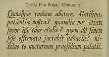
Script typefacesare based on the varied and often fluid stroke created byhandwriting.[1][2]They are generally used fordisplayor trade printing, rather than for extended body text in the Latin alphabet. Some Greek alphabettypefaces,especially historically, have been a closer simulation of handwriting.
Styles
[edit]
Script typefaces are organized into highly regular formal types similar tocursivewriting and looser, more casual scripts.
Formal scripts
[edit]A majority of formal scripts are based upon the letterforms of seventeenth and eighteenth century writing-masters likeGeorge Bickham,George Shelley and George Snell. The letters in their original form are generated by a quill or metal nib of a pen. Both are able to create fine and thick strokes. Typefaces based upon their style of writing appear late in the eighteenth century and early nineteenth century. Contemporary revivals of formal script faces can be seen inKuenstler ScriptandMatthew Carter's typeface Snell Roundhand. These typefaces are frequently used for invitations and diplomas to effect an elevated and elegant feeling. They may usetypographic ligaturesto have letters connect.
Casual scripts
[edit]Casual scripts show a less formal, more active hand. The strokes may vary in width but often appear to have been created by wet brush rather than a pen nib. They appeared in the early twentieth century, and with the advent of photocomposition in the early 1950s, their number rapidly increased. They were popularly used in advertising inEuropeandNorth Americainto the 1970s. Examples of casual script types includeBrush Script,KaufmannandMistral.Some may be non-connecting likeFreestyle Script.
Technology
[edit]
Script typefaces place particular demands on printing technology if the letters are intended to join up and vary like handwriting. A typeface intended to mimic handwriting, such asClaude Garamond'sgrecs du roitypeface, will require manyalternate characters.In digital type these (once drawn) can be substituted seamlessly through contextualligatureinsertion in applications like InDesign, but this was complicated in metal. Another complexity in metal type was thatsortshad to have delicate overhanging parts to interlock. This required careful design and casting for the sorts to fit together without gaps or the sorts breaking, or leaving gaps to be filled in by the natural spread of ink on paper.[4][5]
Script typefaces have evolved rapidly in the second half of the 20th century due to developments in technology and the end of widespread use of metal type. Historically, most signwriting on logos, displays and shop frontages did not use fonts but was rathercustom-designed letteringcreated by signpainters and engravers.[6][7][8][9]Asphototypesettingand then computers have made printing text at a range of sizes far easier than in the metal type period, it has become increasingly common for businesses to use type for logos and signs rather than hand-drawn lettering. In addition, phototypesetting madeoverlap of charactersrelatively simple, something very complicated to achieve in metal type.Matthew Carterhas cited his 1966 Snell Roundhand typeface as deliberately designed to replicate astyle of calligraphyhard to simulate in metal.[10][11]An additional development enabling more sophisticated script fonts has been the release of theOpenTypeformat, which most fonts are now released in. This allows fonts to have a large character set, increasing the sophistication of design possible, and contextual insertion, in which characters that match one another are inserted into a document automatically, so fonts can convincingly mimic handwriting without the user having to choose the correct substitute characters manually.[12]Many modern script typefaces emulate the styles of hand-drawn lettering from different historical periods.
Unicode
[edit]For most conventional usages, the regular alpha-numericcodepointsfor ordinary text should be used, irrespective if their presentation. Script presentation is specified using (for example) thehtmlspan style= "font-family=command.
Formathematical use,there are sets of dedicated codepoints with both capital and small letters. Few fonts provide support for all 52 characters, and their presentations vary in style fromroundhandtochancery handand others.
These characters are: 𝒜ℬ𝒞𝒟ℰℱ𝒢ℋℐ𝒥𝒦ℒℳ𝒩𝒪𝒫𝒬ℛ𝒮𝒯𝒰𝒱𝒲𝒳𝒴𝒵 𝒶𝒷𝒸𝒹ℯ𝒻ℊ𝒽𝒾𝒿𝓀𝓁𝓂𝓃ℴ𝓅𝓆𝓇𝓈𝓉𝓊𝓋𝓌𝓍𝓎𝓏
- Some characters are named "SCRIPT..." in Unicode:
- U+2113ℓSCRIPT SMALL L(ℓ)
- U+2118℘SCRIPT CAPITAL P(℘, ℘) (actually a misnomer, name iscorrectedintoWEIERSTRASS ELLIPTIC FUNCTION)
See also
[edit]References
[edit]- ^Alexander S. Lawson (January 1990).Anatomy of a Typeface.David R. Godine Publisher. pp. 349–380.ISBN978-0-87923-333-4.
- ^Horn, Frederick A. (1936)."Type Tactics: Modern Script Types".Commercial Art.20(119): 194–197.Retrieved30 April2017.
- ^Lane, John A.(1992). "The Origins of Union Pearl".Matrix(12): 125–133.
- ^Hardwig, Florian (2 October 2014)."Venus Motorroller".Fonts in Use.Retrieved30 December2016.
- ^Hardwig, Florian (26 January 2015)."Korbmacher-Verein Kranichfeld invoice, 1939".Fonts in Use.Retrieved30 December2016.
- ^Simonson, Mark."Not a font".Mark Simonson Studio (blog).Retrieved14 December2016.
- ^Coles, Stephen."Lettering is not type".Type Network.Archived fromthe originalon 2021-04-27.Retrieved2018-01-21.
- ^Mosley, James."English Vernacular".Typefoundry (blog).Retrieved14 December2016.
- ^Shinn, Nick."The Golden Age of Hand Lettering in American Advertising".Type Culture.Retrieved1 April2017.
- ^"ADC Hall of Fame: Matthew Carter".ADC.Retrieved2 January2017.
- ^Alexander S. Lawson (January 1990).Anatomy of a Typeface.David R. Godine Publisher. pp. 360–1.ISBN978-0-87923-333-4.
- ^Shaw, Paul (7 April 2010)."Lettercentric: Type as Writing".Print.Retrieved21 September2015.
- Blackwell, Lewis.20th Century Type.Yale University Press:2004.ISBN0-300-10073-6.
- Fiedl, Frederich, Nicholas Ott and Bernard Stein.Typography: An Encyclopedic Survey of Type Design and Techniques Through History.Black Dog & Leventhal: 1998.ISBN1-57912-023-7.
- Thi Truong, Mai-Linh; Siebert, Jürgen; Spiekermann, Erik.FontBook: Digital Typeface Compendium.,FSI FontShop International: 2006,ISBN978-3-930023-04-2
- Macmillan, Neil.An A–Z of Type Designers.Yale University Press: 2006.ISBN0-300-11151-7.
