
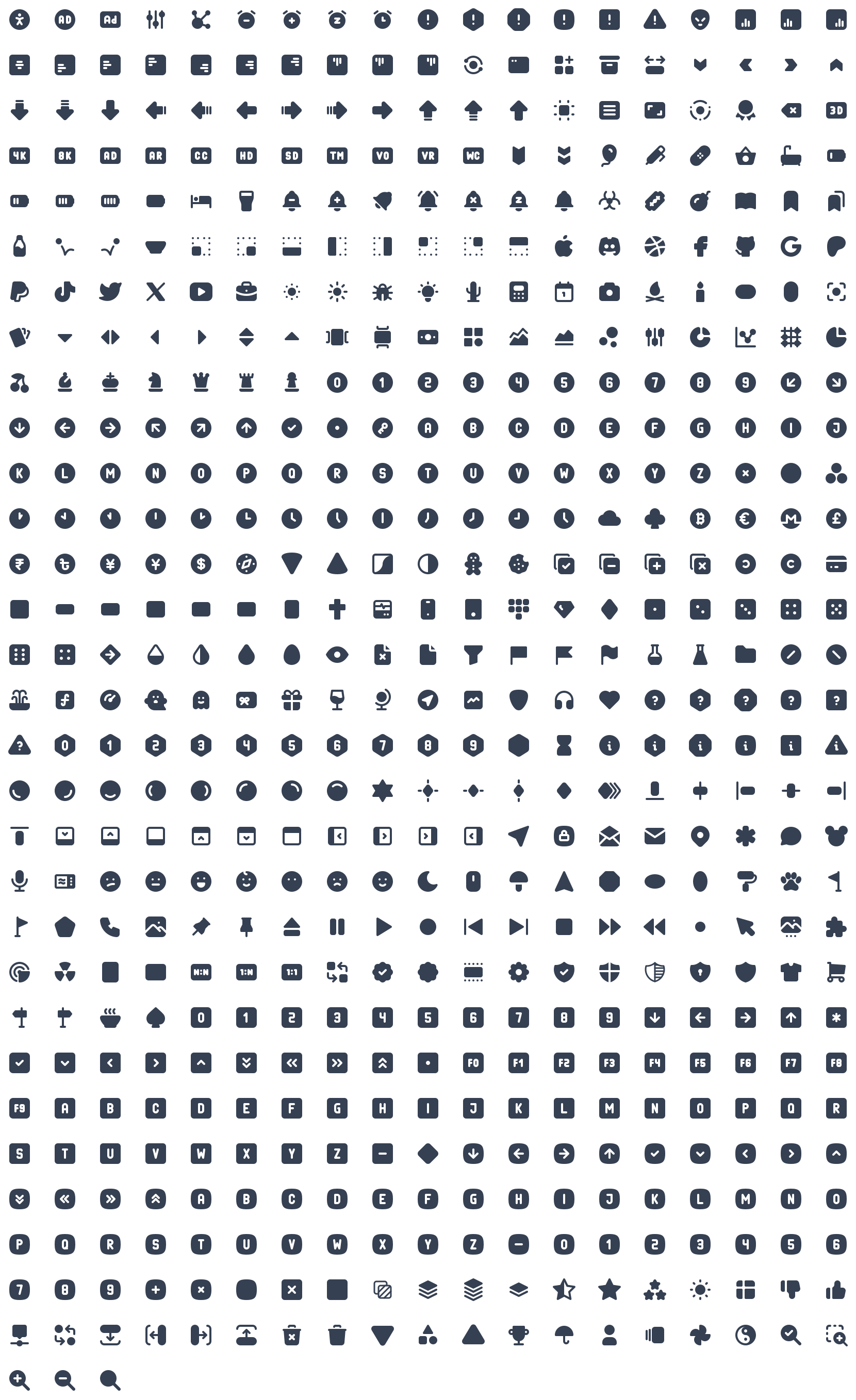
A set of 5450 free MIT-licensed high-quality SVG icons for you to use in your web projects. Each icon is designed on a 24x24 grid and a 2px stroke.
If you want to support my project and help me grow it, you canbecome a sponsor on GitHubor justdonate on PayPal:)

npm install @tabler/icons --save
or justdownload from GitHub.
All icons are built with SVG, so you can place them as<img>,background-imageand inline in HTML code.
If you load an icon as an image, you can modify its size using CSS.
<imgsrc= "path/to/icon.svg"alt= "icon title"/>You can paste the content of the icon file into your HTML code to display it on the page.
<ahref= "">
<svg
xmlns= "http:// w3.org/2000/svg"
class= "icon icon-tabler icon-tabler-disabled"
width= "24"
height= "24"
viewBox= "0 0 24 24"
stroke-width= "1.25"
stroke= "currentColor"
fill= "none"
stroke-linecap= "round"
stroke-linejoin= "round"
>
...
</svg>
Click me
</a>
Thanks to that, you can change the size, color and thestroke-widthof the icons with CSS code.
.icon-tabler{
color:red;
width:32px;
height:32px;
stroke-width:1.25;
}Add an icon to be displayed on your page with the following markup (activityin the above example can be replaced with any valid icon name):
<svgwidth= "24"height= "24">
<usexlink:href= "path/to/tabler-sprite.svg#tabler-activity"/>
</svg>
React components available through@tabler/icons-reactpackage.
import{IconAward}from'@tabler/icons-react';

constMyComponent=()=>{
return<IconAward
size={36}// set custom `width` and `height`
color="red"// set `stroke` color
stroke={3}// set `stroke-width`
strokeLinejoin="miter"// override other SVG props
/>
}@tabler/icons-reactexports its own type declarations for usage with React and Typescript.
For more details, see thedocumentation.
Vue components available through@tabler/icons-vuepackage.
<template>
<!--basic usage-->
<IconHome/>

<!--set `stroke` color-->
<IconHomecolor="red"/>
<IconHomestroke="red"/>

<!--set custom `width` and `height`-->
<IconHomesize="36"/>

<!--set `stroke-width`-->
<IconHomestrokeWidth="2"/>
<IconHomestroke-width="2"/>
</template>

<script>
//Returns Vue component
import{IconHome}from'@tabler/icons-vue';

exportdefault{
components:{ IconHome }
};
</script>
or with<script setup>
<scriptsetup>
//Import Vue component
import{IconHome}from'@tabler/icons-vue';
</script>

<template>
<IconHomecolor="red"size="36"strokeWidth="2"/>
</template>
For more details, see thedocumentation.
Angular components available throughangular-tabler-iconspackage.
Install the package, then create icons module:
import{NgModule}from'@angular/core';

import{TablerIconsModule}from'angular-tabler-icons';
import{IconCamera,IconHeart,IconBrandGithub}from'angular-tabler-icons/icons';

// Select some icons (use an object, not an array)
consticons={
IconCamera,
IconHeart,
IconBrandGithub
};

@NgModule({
imports:[
TablerIconsModule.pick(icons)
],
exports:[
TablerIconsModule
]
})
exportclassIconsModule{}
After importing theIconsModulein your feature or shared module, use the icons as follows:
<i-tablername= "camera"></i-tabler>
<i-tablername= "heart"style= "color: red;"></i-tabler>
<i-tablername= "brand-github"class= "someclass"></i-tabler>angular-tabler-iconsexports its own type declarations for usage with Typescript.
For more usage documentation refer tothe official documentation.
Svelte components available through@tabler/icons-sveltepackage.
<scriptlang="ts">
import{IconHeart}from '@tabler/icons-svelte';
</script>

<main>
<IconHeartsize={48}stroke={1}/>
<IconHeartsize="32"stroke="1.5"/>
<IconHeartcolor="crimson"class="p-1"size="96"stroke="2"/>
</main>All files included in@tabler/iconsnpm package are available over a CDN.
<scriptsrc= "https://cdn.jsdelivr.net/npm/@tabler/icons@latest/icons-react/dist/index.umd.min.js"></script><linkrel= "stylesheet"href= "https://cdn.jsdelivr.net/npm/@tabler/icons-webfont@latest/tabler-icons.min.css">To load a specific version replacelatestwith the desired version number.
<scriptsrc= "https://cdn.jsdelivr.net/npm/@tabler/[email protected]/icons-react/dist/index.umd.min.js"></script><iclass= "ti ti-brand-tabler"></i>content:'ec8f';To compile fonts first installfontforge.
When compiling the font it will look for a json filecompile-options.jsonin root folder (same folder as thepackage.json) In this file you can define extra options:
The default settings if you have not defined the file will be:
{
"includeIcons":[],
"fontForge":"fontforge",
"strokeWidth":null
}
The fontforge executable needs to be in the path or you can set the path to the downloaded fontforge executable in the configuration file. If you installed in on a mac in your application directory it will be/Applications/FontForge.app/Contents/MacOS/FontForge.You can set this value in thecompile-options.jsonfile.
{
"fontForge":"/Applications/FontForge.app/Contents/MacOS/FontForge"
}
To compile the fonts run:
npm run build-iconfontBy default the stroke width is 2. You can change the stroke width in thecompile-options.json
{
"strokeWidth":1.5,
}
To reduce the font file size you can choose to compile a sub set of icons. When you leave the array empty it will compile all the fonts. To compile only two icons you can set for example the following option in thecompile-options.json:
{
"includeIcons":["alert-octagon","alert-triangle"]
}
Optional propertyincludeCategories- an array or string of icon categories to include, category names are case-insensitive.
{
"includeCategories":["Devices","System"]
}
or
{
"includeCategories":"Devices System"
}
Optional propertyexcludeIcons- an array of icon names using to exclude some category icons:
{
"includeCategories":["system"],
"excludeIcons":["adjustments"]
}
Complex solution:
{
"includeIcons":["alert-octagon","alert-triangle"],
"includeCategories":["devices","system"],
"excludeIcons":["adjustments"]
}For Android or Desktop you can usecompose-iconsto use icons in your projects. (seedocs)
All icons in this repository have been created with the value of thestroke-widthproperty, so if you change the value, you can get different icon variants that will fit in well with your design.
Tabler Icons is licensed under theMIT License.
